

EDIT: I hit the publish button on this last nite too early due to my excitement over the Texans game. Here is the post as it was intended to be. Cue the eyeroll emoji!
I've mentioned previously that the 1961 Stamps are my favorite Topps insert, ever. The '62 stamps were done in full color but there is something about the brown and green gems from the previous year that captured my attention back then and they remain special to me even now. I've seen 'dull' and 'drab' used in descriptions of the stamps but to my eyes they are wonderful.
For some reason they trigger great memories of the ride home from St. Mary's School on the Public Service #13 bus. My buddy and I would hop off one stop early and hit Sal's store for a pack of cards. The stamps held almost as much of an allure as the cards did.
Off and on for the last few years I've looked into finding one of these stamp albums from 1961. I stumbled on this one recently while looking for something else on eBay. It was in decent shape for the price and came with quite a few stamps in it.
The cover is marked with the original owners' names but that doesn't bug me at all. I took pics with my phone and a digital camera because I didn't want to put this on my scanner. Here's a look at the album and a few stamps.

The artwork on the inside of the front cover sure beats the cover art. That batter always seemed odd to me. Here is a closer look at the text.


The album came with 75 of the 207 stamps in the set. 74 of them are mounted on the pages. The seller included a loose Stan Musial stamp. That's how I came across the album on eBay, through a Musial search. The seller low-balled the number of stamps by saying it contained 71. Interestingly Topps allocated 10 places for stamps per team page but issued 12 stamps per team. I guess it was up to us kids of 1961 to determine who made the book. I suspect that the first ten players we found for each team got 'licked and sticked'.
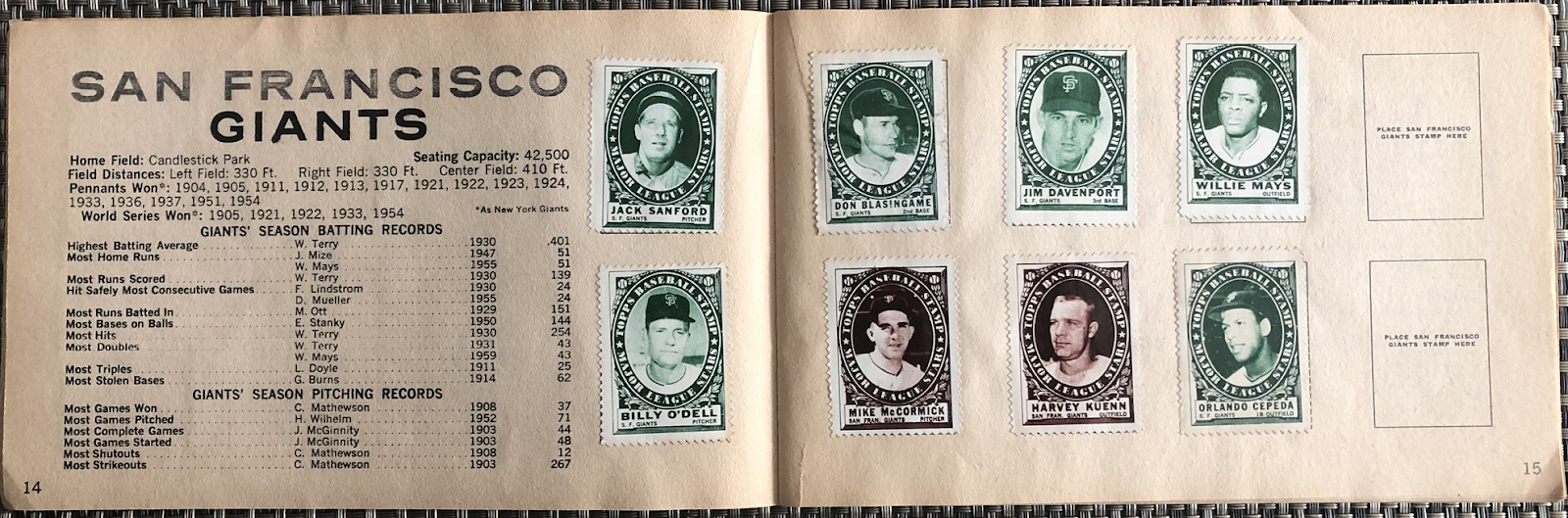
BTW...I keep seeing references to the stamps that claim the two colors correspond to the two leagues. That is obviously not the case.

I'm not going to show every team. The Cubs page has Ernie Banks' stamp. It's one I remember from back in the day.
Here's a closer look at a brown and a green stamp. They just have more 'character' than the full color, no background '62 version. Those ornate borders mimic old postage stamps. This design was first used on a hockey stamp set a few months prior.


Sidebar: The hockey stamp set used two different styles as best I can tell. The ornate borders showcased old-time players while a simpler frame had the current stars. Both of these images are from the 'net.

Back to the baseball stamps...
I have about twenty or so stamps already in my collection. I'm not sure how many of those are dupes of what came in the album. I'd guess I'm nearly halfway to filling this thing up. And, yes, I am going to stick them in it!
The Orioles page gives a better look at the info included. I ate this numerical shit up with a spoon as a kid. Field dimensions for each stadium? Oh hell, yes!

The original owners seemed to collect more NL stamps than AL ones. The NL pages average five stamps on them. Many of the AL ones have two. The Angels page is stampless. The Senators, shown below, has a lonely Dale Long stamp.

There were plenty of stars in this thing.


Al Kaline was issued in both the brown and green tint. That makes a master set complete at 208. If that matters to anyone.

The space below Yogi shows evidence of once having a stamp mounted there. The seller might have pulled a Mantle but he or she certainly didn't cherry-pick the album. There are plenty of stars included.

The Reds and Giants pages are among the most complete in the album. Nice to see Frank Robinson there.

Willie Mays appears capless on his stamp.
The album's centerfold had 1960 stat leaders for both leagues. Back in those days when you needed to buy Street And Smith's Annual or have a Sporting News subscription, this was great stuff.


Inside the back cover was a listing of WS results up to 1960.

And the back cover itself.

I haven't started looking for stamps to fill this thing up yet. I have a couple other projects on the stove at the moment. But if you have any '61 stamps you are looking to get rid of, hit me up, ok?
Nice Bob. I agree I like the 61 Stamps the best
ReplyDeleteI keep going back and forth on collecting baseball stamps... I keep meaning to dive into it, but then I never pull the trigger.
ReplyDeleteI find these stamps to be strangely beautiful, but I also used to be a postage stamp collector; I wonder if that has anything to do with my preferences?
Speaking of postage stamps, I wonder if there might be some sort of postage stamp collecting mounts which would be preferable to sticking the stamps directly into the book (unless that's what you really want to do). Back in the 1980's, Crystal Mount was the "9-pocket sheet" of the stamp collecting world, I wonder if they've made advances since then.
Probably a better idea than the glue stick I bought at Target today.
DeleteThe green stamps came out with the first series and (I believe) the second series. The brown stamps came out with the third series. I remember Kaline having two stamps, like you said. Interestingly, in the '62 set, those with a yellow background came out in the first series; the second series was mixed between yellow and red backgrounds; and the third series had all red backgrounds. The determinator in the second series as to whether the stamps were yellow or red? Why, none other than the infamous "green tint" card variations! If the cards in the pack had the green tint, the cards in the pack had the yellow stamps; if they were the non green tint variation, they had the red stamps.
ReplyDeleteGreat background info, thanks. It's weird that I bought lots of '62 packs and don't remember much about the stamps. I guess they didn't hold my interest as much as the '61s.
DeleteOoooh those are very pretty. I also used to collect stamps (and coins). I've migrated my coins to 2x2 holders. No idea what to do with the stamps. I'm starting to wonder if they should go in 20-pocket 2x2 pages like the coins. I've been using those for the mini cards already as it is and stamps might be a natural fit.
ReplyDeleteAlso, are they printed with halftone screens or do they actually have that etching/intaglio feel that classic stamps have?
DeleteUsed my loupe for a close look and they seem to be halftone screen printed.
DeleteSometimes it takes a post like this one to actually make me appreciate something. I've seen these here and there in the past, but never gave them much thought. I have to pick up a few of these for my collection. They're beautiful. Best of luck with this project.
ReplyDelete