Friday, March 29, 2019

Floating Cubs Heads!

Or would it be 'Floating Cub Heads'? Or 'The floating heads of Cubs'? Dunno.

But I do know that the 1971 Cubs team card is unique and a lot of fun.


The Cubbies did this for several years between 1971 and the early 1980s. Many have asked why but I'm not sure what it was with the Cubs and their aversion to the standard team photos. Maybe they just liked the look. They certainly were not the first to do this.


And strangely the Cubs had a standard team pic in the '75 set but the White Sox went 'floating head'. This has been discussed on several blogs in the past but with the addition of the '71 card, it's the first time for me to explore it up close.


That Cubs card was part of a COMC stack of about 40 1971s that included a couple of hall of Fame members on really nice cards.


Wednesday, March 27, 2019

Mon cendrier Expos

I'm in New York City this week attending my aunt's funeral (2019 has not been a good year so far). I have a few posts scheduled. I hope they make it because I won't be checking in very often.

The pic below is the latest 'display' piece in my collection. I've always had a soft spot for expansion teams, particularly the Pilots and Expos. Jim Bouton's Ball Four was my connection to the Pilots and a family trip to Montreal in 1969 during which we took in a game at Parc Jarry was one of the memorable vacations we experienced.  I'll never forget my Dad trying to get restaurant recommendations from a group of French-speaking firemen at a fire station across from our hotel. Good times! 


I thought this was a fun little item and was happy to win the auction. I'll probably keep it on the top of my two-level desk and use it for paper clips or something. The Bob Bailey card is there for perspective.

Speaking of the Expos, I won a small oddball set a few months ago that I still haven't scanned. I'll get that posted this week.

Monday, March 25, 2019

Astrodome Postcards


I'm not sure where these postcards came from but they bring back some fond memories of great events. The top one was taken during the first game played there in April 1965. The person who wrote the blurb on the back was either not using tier glasses or looking at a different photo. Check it out:


First of all, it seems odd to mention the time the game started at all. Clock clearly shows 7:46


This sure looks like the lineup card/ground rules meeting.


 But whatever. It's a neat card.


This one is closer to my heart. It from the October, 1970 Houston Cougar football game versus Alabama. The Coogs lost with me somewhere over in the stands on the left, the student section. But the Coogs went on to an 8-3 record and a Top Twenty finish. A couple of years later I would watch games from the press level. That was fun. But the view you see right here is the one I had for years as a young alum. This was my group's favorite spot. It gave us a perfect view of Coach Bill Yeoman's veer offense.  It was up here where I also watched the basketball Game of The Century. This one brings back some great memories.


Saturday, March 23, 2019

"Buy the Card, Not the Holder"

Spend any amount of time on one of the card collectors forums and before too long you're likely to see the phrase I used as the title of this post.

"Buy the Card, Not the Holder" refers to purchasing graded cards and means just that...if you like how a card looks, and it's at a price that works, the hell with the grade it received. Here is an example using a card that brought me closer to finishing the '61 set.

The Ernie Banks All-Star card isn't cheap. I was able to pick this one up at a great price:


You can see it in the holder...graded as "Poor 1"


EDIT...Adding a shot of the reverse in the holder:


It looks better than that to me but then again, I don't grade cards for a living. In any case, Ernie is out of the plastic and in the binder. I'm  down to just these seven five cards:

531 Jim Coates
541 Rollie Sheldon
554 Pirates Team Card
563 Bob Cerv
579 Willie Mays AS

I'm going to go up to a big show in the Dallas area in April and hope to polish this thing off.

Tuesday, March 19, 2019

Baltimore Colts Championship Dish


I'm a sucker for stuff like this. I don't know the story behind it but I found it on eBay a few weeks back and threw an offer down. It commemorates the '58 Championship Game and I was pretty excited to pick it up. I've looked it over pretty close and it appears to be a legit vintage piece.

I have some vintage Colts glassware and a commemorative stein along the same line and it's a nice companion piece for those. I'm gonna need some new shelves soon.

Here is it with a card for comparison's sake.


 And the back.


Oh, here is another display piece, a furry one. Her name is Rascal and she is our 'grandcat'. She belongs to one of my sons and his gf. Rascal spends a lot of time with us because her 'parents' are always off doing 'young couple stuff'. Well, that and the fact that Rascal likes it here because my wife spoils her.


That's her kitchen perch. She also has one in here with me. She likes watching me type while we listen to Oscar Peterson. Mostly, she likes to nap.

It doesn't get much better than OP doing Satin Doll.


Harry Howell, RIP


Harry Howell, long time Ranger standout defenceman and Hockey Hall of Fame inductee died earlier this month at the age of 86.

I grew up among Rangers fans. All my friends, no matter their baseball or football loyalties, loved the Blueshirts. And we all had our favorite players. I idolized Eddie Giacomin, my two closest pals were Rod Gilbert devotees. But I never remember anyone claiming Harry Howell as his favorite. Howell was not flashy. Most blue line guys back then usually stayed back, rarely getting involved in the rush so they didn't score much. (Bobby Orr changed all that.) They were defencemen and they played mostly, well, defense. Howell was my father's favorite Ranger. If you had known my father that fact would not surprise you.

I had one brush with Harry Howell and it happened when he ventured into the WHA after 17 seasons with the Rangers. He was playing for the NY/NJ Golden Blades (or maybe it was the Knights) and they came through Houston to play the Aeros. As usual, my snowbird college buddies and I would make our way down to the concourse of the old Houston Coliseum before the game and during intermissions to watch the players tromp back and forth from the ice to the locker rooms. They had to come right through the crowd 'walking' on a rubber mat and protected by a rope held by security guards. It was not unlike what happens when pro golfers exit a green to make their way to the next tee box. Anyway, on this night I wore my Rangers tee and when Howell passed by I said something witty like "Hi, Harry!".  I remember that he replied, "Hey, Rangers" and moved on by.

All that is a too long introduction to the item at the top. It's a 6"x6" ceramic tile from a group known as H.M. Cowan/Screenart Hockey Tiles. They are a 1962/63 item that has a very murky history. Supposedly, and I only found one source of info (and no checklist), they were designed with the intention of being souvenirs to be sold in NHL arenas. But they were unlicensed and the project never got very far. Most (again, supposedly) were destroyed but obviously, some have survived and are neat little period pieces. The tiles depicted players and coaches from the six franchises in existence at that time. The number of different tiles is estimated at 104 but that's just someone's guess. I've been poking around eBay and auction sites and have seen about six different Rangers on these things, including Gump Worsley (a tile I'd give my right arm for).

I was completely unaware of these until the February TriStar show. I spotted a couple of Ranger's tiles (Howell and Dave Balon) in a case on a table near the front. They were listed at $150 each. The dealer(s) who manned those tables had nothing but rare and fascinating oddball items. They had one display case filled with loads of unusual Roberto Clemente items. Another case has Topps rarities and test issues from the 50s, 60s, and 70s. Crazy rare stuff like the '68 Plaks, the '67 Punchouts and on and on. They also had zero interest in chatting with a schlub like me dressed in a Baltimore Colts tee-shirt and Ping cap. I stood around for quite a while as they dealt with neighboring dealers, a guy with a briefcase of graded cards and their cell phones. Meanwhile, I had $150 in cash in my hand waiting to get their attention.

Finally, I gave up and figured I'd come back later when they were not quite so busy. But the tiles had me hooked. I went and sat down and pulled out my phone to find out exactly what I had been looking for. After a few minutes I had a decent amount of info and on a whim I checked eBay. Well, what do you know? I found a guy selling the Howell tiles for about one-third of what the Snooty Table© dealers were asking. I bought it without a second's hesitation. Even the $15C shipping didn't faze me...heck that's just $10 American! 😏


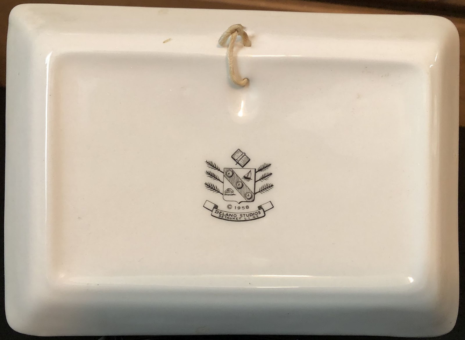
For the curious, here is the back of the tile.


So, there it is. A great Rangers display piece now on my shelves. Oh, and I spent the money I saved with other, more appreciative dealers. Not all of it there at TriStar but a week later with my dealer friend at his hotel show. His ever-rotating cheap crap boxes featured some hockey and I was happy to dig these cards up:


I've already made this post far too long so I won't comment on each card very much. But I have to say that I hated Ken Hodge with the searing heat of an exploding sun when he played for the Bruins. To see him in Rangers gear takes at least a month off my life.


These Rangers' unis were almost enough to make me an Islanders fan.


No, not really, but I  consider them the worst mistake in team history. Given the Rangers legacy, that's saying a lot.


And finally, Eddie!! I told Darryl (a fellow Rangers fan from NJ) that this card should have been in his glass case instead of his quarter bin.


Friday, March 15, 2019

Great Plains Greats set

I bought the Chief Bender card out of the 1975-76 Great Plains Greats set a month or so ago at one of the hotel card shows. Oddball sets can be fun and I got curious about the set and dug around online. I found a "complete" set cheap and bought it on a whim. It's full of Hall of Fame players and other big names. All the pics used are black and white.

Here's that Bender:
 

The seller (and a lot of other online sellers) list the set at 24 cards. But that's not technically correct. Hence the quotation marks around 'complete' in the first paragraph.

But first here is a look at some of the cards that I received. They come in groups of eight with each group in a different color, both front, and back. The artwork that is printed behind the players' name is different for each color as well.


The Allie Reynolds and Bob Feller appear to be different shades of blue but I think that's just a quirk of the printing process.


Carl Hubbell, star of the 1934 All-Star Game.


Walter Johnson and Dave Bancroft. Two very serious guys.


The green group has three of my favorite photos in it. Yogi, Cool Papa Bell, and Roger Maris.


The backs have a few brief essentials and a write-up, brief stats and an ad for the set's sponsor, Sheraton Hotels. Each color group has a different Sheraton. The back colors are a variation of the fronts..the red cards have purple-ish reverse accents.


Green fronts got a darker shade on the back...


Blue fronts got a lighter shade...


One eBay seller says the cards were distributed mostly in Iowa. But the Sheraton hotels listed in the ads were in Omaha, Nebraska and Wichita, Kansas, so who knows? These cards are larger than standard modern cards which will make storing them a problem. They are only a whisper wider than the pre-57 cards from Topps so I may try using the 8-pocket pages. Here's one with a standard card for comparison.


I mentioned that sets are usually listed as complete at 24 but there were two groups of nine cards each that were also distributed which brings the total to 42 players. The additional 18 cards were not Sheraton sponsored but carry an ad for NU SASH windows, a company that now seems to be active across the MidWest.

There are also some that I have found with a promo blurb for the Great Plains Sports Collectors Association. I can't find any reference to that group now and I'm also unsure of which cards carried the back promoting it. I'm fairly certain it was the last two (highest numbered) groups but that's just a guess. That grouping also contains the Mickey Mantle card. I might dig around on eBay and COMC and try to puzzle it all out but I'm not sure it's a big deal.

Here is the 42 card checklist. I've coded them in the colors that are found on the front.

1 Bob Feller             
2 Carl Hubbell             
3 Jocko Conlan             
4 Hal Trosky             
5 Allie Reynolds            
6 Burleigh Grimes            
7 Jake Beckley            
8 Al Simmons  
         
9 Paul Waner            
10 Chief Bender            
11 Fred Clarke            
12 Jim Bottomley            
13 Dave Bancroft            
14 Bing Miller            
15 Walter Johnson            
16 Grover Alexander  
          
17 Bob Johnson            
18 Roger Maris  
 
        
19 Ken Keltner            
20 Red Faber            
21 Cool Papa Bell            
22 Yogi Berra            
23 Fred Lindstrom            
24 Ray Schalk              

25 Lloyd Waner            
26 John Hopp            
27 Mel Harder            
28 Dutch Leonard            
29 Bob O'Farrell            
30 Cap Anson            
31 Dazzy Vance            
32 Red Schoendienst            
33 George Pipgras
          
34 Harvey Kuenn            
35 Red Ruffing            
36 Roy Sievers            
37 Ken Boyer            
38 Al Smith            
39 Casey Stengel            
40 Bob Gibson
41 Mickey Mantle
42 Denny McLain


There are also two unnumbered checklists that cover only the #s 1-24. They can be found in either red or blue.

Here (scan from TCD) is what the checklists look like. The back had a 'Buy the set' coupon:


And from COMC and The Trading Card Database comes scans for the alternate(?) backs. I found a couple with the club promo...


....but mostly I see them with the NU SASH advertising back.


If I could find the #25-42 cards as a group I might be inclined to go after them but as singles, with the Mantle going for $10 or so, I'll pass for now.

Tuesday, March 12, 2019

'71 Stan Bahnsen..WTH is going on?

I was sorting my 1971s today, culling dupes, and getting ready to binder this thing when I came across the two Stan Bahnsen cards I owned.  Check them out.....


Notice anything?  Look at his eyes. On the card on the left he is looking skyward. On the other card he isn't. And it's obvious. What exactly is going on here? I can't find any reference to a Bahnsen variation online. Did Topps think having him looking up was somehow not attractive and had an artist 'fix' it? Or is it just the opposite? Did they want to improve the somewhat bug-eyed look and the artist did his best to change it?

It also crossed my mind that it was a case on my copy of one of these had been inked by some kid. But I looked at the cards using my jeweler's loupe and, while I'm no print process expert, it was obvious that neither card had been adulterated after coming out of the pack.

Blowing up the two sets of eyes gives much the same effect as using the loupe:


And it gets kind of weirder. I went to COMC and found dozens of copies of this card. Quite a few of them looked like this:


Am I nuts or does Bahnsen have brown eyes on this card? Here is a closer look. Obviously, I can't get the same dot pattern to show on a 'borrowed' pic from the web but even so...those eyes are not blue.


It's very possible that the third card has eyes that match the cards I have and the scan online is simply playing tricks on me. I'll be able to look closer at this copy because I went ahead and purchased it..in the interest of card science!

I looked at the back of both cards to see if there were any differences but, other than one having a crappy (and not unusual) 'off' tone, they were identical. My dealings with the '62 Green Tints prompted me to look at the photos for cropping differences. I guess it's possible that the printing plate was pulled and the card redone, sort of like the '62 second series was, but if so the tell-tale cropping differences are not apparent. At least to me.


And I had one more idea. I checked Night Owl's 1971 blog to look at his copy of this card. (I hope that was OK, Greg.) It appears to be a match for the COMC example. Maybe in-hand ALL these cards will show Bahnsen with blue eyes. But even if that's true I'm still left wondering how/why Topps changed which way he was looking.


And a note to Night Owl...I'd bet good money that the player in the background is Fritz Peterson.