Tuesday, October 30, 2018

Brown and Red

First up is another card from a contest I won on Net54.


This 1933 Goudy Dick Coffman gives me about a half dozen from the set. (The best, by far, is this Paul Richards card). Coffman broke in with the Senators in 1927 but was soon traded to the Browns for whom he pitched until he was dealt back to the Senators in June of 1932 for pitcher Carl Fischer.

After that '32 season the Nats and Browns traded the same two pitchers for each other again! Coffman went on to pitch another three years for the Brownies. Finally, in November of 1935, Coffman managed to land in a better situation than toiling for two AL bottom feeders.

He was purchased by the New York Giants and spent three seasons as their #1 bullpen guy. He led the NL in games pitched and saves in 1938. He even garnered a few MVP votes. He pitched (rather unsuccessfully) in both the '36 and '37 World Series' for the Giants against the Yankees.

In 1940 he landed with the Boston Bees and then spent several seasons in the minors before he reappeared in the majors briefly with the Phils in 1945. In '46 he did some pitching and managing in the minors and then was gone from pro ball.

I'm posting an oversized image of the card's back to make it easy to read. The write-up mentions his Washington-St Louis travels and calls him an 'elongated young man, towering(?) 6 feet, 1 1/2 inches'.


Next up is another 1962 'type card' for the back of that set's binder. This is the Venezuelan version of the Wally Post #148. Topps had previously distributed versions of the '59 and '60 set in Venezuela. But the '62 set is the first that has Spanish language write-ups on the back.


Topps, as was their normal MO in these sets, only distributed partial versions in Venezuela. In this case the cards are from the first two series minus #197 and #198 which supposedly don't exist. There are no 'green tint' versions, either.

You can see the differences in the card backs below. Interesting that Topps kept the English wording in the stats block heading and the player position under his name.  This article on the PSA site mentions differences in ink and cardboard color but honestly I'm just not seeing much. Small sample size I suppose.


The 'regular' (US non-green tint) version from my set is on the left, the Venezuelan version on the right. That PSA article is right about one thing, these Venezuelan Topps cards are usually found in pretty brutal condition. I decided on the Post because it was in decent shape and it's among the better poses in the cheap group I was picking from on eBay.


I need to find a green-tint Post and look at them all side-by-side I think.

Friday, October 26, 2018

1961 Topps Stamp Album (Post with actual content! LOL)


EDIT: I hit the publish button on this last nite too early due to my excitement over the Texans game. Here is the post as it was intended to be. Cue the eyeroll emoji!

I've mentioned previously that the 1961 Stamps are my favorite Topps insert, ever. The '62 stamps were done in full color but there is something about the brown and green gems from the previous year that captured my attention back then and they remain special to me even now. I've seen 'dull' and 'drab' used in descriptions of the stamps but to my eyes they are wonderful.

For some reason they trigger great memories of the ride home from St. Mary's School on the Public Service #13 bus. My buddy and I would hop off one stop early and hit Sal's store for a pack of cards. The stamps held almost as much of an allure as the cards did.

Off and on for the last few years I've looked into finding one of these stamp albums from 1961. I stumbled on this one recently while looking for something else on eBay. It was in decent shape for the price and came with quite a few stamps in it.

The cover is marked with the original owners' names but that doesn't bug me at all. I took pics with my phone and a digital camera because I didn't want to put this on my scanner. Here's a look at the album and a few stamps.


The artwork on the inside of the front cover sure beats the cover art. That batter always seemed odd to me.  Here is a closer look at the text.


The album came with 75 of the 207 stamps in the set. 74 of them are mounted on the pages. The seller included a loose Stan Musial stamp. That's how I came across the album on eBay, through a Musial search. The seller low-balled the number of stamps by saying it contained 71. Interestingly Topps allocated 10 places for stamps per team page but issued 12 stamps per team. I guess it was up to us kids of 1961 to determine who made the book. I suspect that the first ten players we found for each team got 'licked and sticked'.

BTW...I keep seeing references to the stamps that claim the two colors correspond to the two leagues. That is obviously not the case.


I'm not going to show every team. The Cubs page has Ernie Banks' stamp. It's one I remember from back in the day.

Here's a closer look at a brown and a green stamp. They just have more 'character' than the full color, no background '62 version. Those ornate borders mimic old postage stamps. This design was first used on a hockey stamp set a few months prior.


Sidebar: The hockey stamp set used two different styles as best I can tell. The ornate borders showcased old-time players while a simpler frame had the current stars. Both of these images are from the 'net.


Back to the baseball stamps...

I have about twenty or so stamps already in my collection. I'm not sure how many of those are dupes of what came in the album. I'd guess I'm nearly halfway to filling this thing up. And, yes, I am going to stick them in it!

The Orioles page gives a better look at the info included. I ate this numerical shit up with a spoon as a kid. Field dimensions for each stadium? Oh hell, yes!


The original owners seemed to collect more NL stamps than AL ones. The NL pages average five stamps on them. Many of the AL ones have two. The Angels page is stampless. The Senators, shown below, has a lonely Dale Long stamp.


There were plenty of stars in this thing.


Al Kaline was issued in both the brown and green tint. That makes a master set complete at 208. If that matters to anyone.


The space below Yogi shows evidence of once having a stamp mounted there. The seller might have pulled a Mantle but he or she certainly didn't cherry-pick the album. There are plenty of stars included.


The Reds and Giants pages are among the most complete in the album. Nice to see Frank Robinson there.


Willie Mays appears capless on his stamp.


The album's centerfold had 1960 stat leaders for both leagues. Back in those days when you needed to buy Street And Smith's Annual or have a Sporting News subscription, this was great stuff.


Inside the back cover was a listing of WS results up to 1960.


And the back cover itself.


I haven't started looking for stamps to fill this thing up yet. I have a couple other projects on the stove at the moment. But if you have any '61 stamps you are looking to get rid of, hit me up, ok?

Thursday, October 25, 2018

1962 Topps is complete..or is it?


And there it is, the final card I needed for my 1962 Topps set build. It came from eBay via one of my slew of lowball snipes finally hitting. It's mis-cut (no surprise in this set) and the back has a blob of ink/glue/carbon/gunk/stamping on it. But for the price, I'll take it.

And speaking of the back...in the pre-stathead days, when wins mattered, one of the most fascinating things in the world for me was number-choked backs of team cards like this one. Jack Kralick was 4-1 versus KC but 1-3 against the Yanks? Pistol Pete Ramos lost 20 games? It was the sort of thing we made mental notes of  and used in our Whiffleball tournaments and stoop-ball games.


While it's the last card to be crossed off my needs list, it is NOT the final card that will go into the '62 binder. I have a couple of graded cards that I'm going to break out of their tombs soon. Over and above that is the reason this is going to be a rather long, drawn-out post.

The question of what makes up a 'complete' vintage set is one that pops up from time to time. I've seen it discussed on Twitter, Net54 and on blog posts. I've given it some thought as I build sets as well. Is a 'complete' set a 'master' set with every known corrected error and all the variations? Do you need all inserts, a wrapper? Or is a set 'complete' with one of each card number?

Trying to decide that for the 1962 set is far from simple. It's a fun and kind of crazy set to chase. It contains far more 'off the wall' weirdness than any other set of the era.

While building my 1959 set (first vintage chase) I came up with a 'rule' for myself. That set has no photo variations. But it is chock full of little and not so little errors/variations on the backs...wrong birth years, 'traded to' lines of text, stat anomalies, etc. Some were corrected, others not. I decided then that I would put together the set as the 'ten-year-old CommishBob' would. If it wasn't something I would have noticed as I was opening the pack, or when I was shuffling through my cigar box stash, well I wouldn't worry about it.

But, oh Lord, this 1962 set. Logo/no logo variations, completely different photos for some players, different croppings, green tints, green tints with different croppings, floating heads on corrected team cards, mis-numbered cards, mis-numbered cards with a different photo, mis-numbered cards with a different photo AND green tint, and so on.


Example #1, the above Willie Tasby cards. On the left a card with Tasby's cap logo removed. On the right Tasby with a logo. The 10-year-old CommishBob would have noticed that and put both into his cigar box. So both go into the binder. The same would go for Bob Buhl who had logo'd and non-logo'd caps.


I'd have been mystified by the two different Bill Kunkels. And wanted them both. There are seven or eight cards that show the same player with alternate poses. All come from the 2nd Series (cards 110-196). I won't post them all but here are my two favorites, Wally Moon and Lee Walls. Moon is the only one I remember noticing when these cards were new. Which, now that I think about it, is evidence that we got some of the 'botched' 2nd Series cards in Essex County, New Jersey in the spring of '62.


The story behind these is that Topps farmed out the printing of the series when they got into a crunch. The plates were damaged in transit, some could be salvaged, some not and those were remade. That is also the reason that the 2nd Series has 'green tint' variations. PSA has the story, or at least the most widely accepted version of the story on their website.


Angel team card...no problem. But your friend opens a pack three days later and gets this.....


...Angels team with two floating heads? The hell? This would have been a difficult decision for me as a kid but I'm pretty sure I'd have wanted both versions. So I have them both in the binder now. And no, I don't know who the two floating heads are. I think I had an answer at some point but it's eluding me right now despite my decent google skills.

But those were fairly straightforward and easily addressed issues. More complicated is the Card #139 Hal Reniff/Babe Ruth deal. The Ruth card below is part of the Babe Ruth Special subset in the 2nd Series. It is the 'correct' #139 but not nearly the only one. I'm going to try to sort it out by memory:

  1. The 'correct' Ruth Hits 60 (below on left)
  2. The Green Tint Ruth Hits 60 which had a lime green field and is cropped differently, the foul pole is visible.
  3. Portrait card of Hal Reniff which is numbered #139 but is supposed to be #159 in the checklist. (Center card below)
  4. Hal Reniff posed action card, shows green tint. Also mis-numbered as #139 (Shown on right below)
  5. The 'correct' Hal Reniff card, his portrait card with the #159. 
Yikes. My sense is that I've have had to collect the Ruth and the three Reniffs (both portraits and the one action pose). So that's what I picked up for the build.


I figured a look at the back of the Ruth/Reniff mess couldn't hurt.


I've saved discussion of the 'green tints' until now. They are an interesting variation. I really don't have a handle on how I would have dealt with them in 1962. I suspect I'd have noted the differences but not cared. After all, the pictures were (except for the previously noted changes) the same. They each have minor cropping differences but I never would have noticed that. Sidebar: I found an interesting page that defines and shows each of the versions of the green tints. Fascinating stuff (to me anyway).

Some of the differences are subtle. The Pumpsie Green (irony noted) for example:


The color variation isn't particularly noticeable until you put the two cards next to each other. The cropping differences can be seen in the upper left corner where the upper deck meets the card border differently. The color of the woodgrain border also varies. I guarantee I never would have noticed that as a kid.

But some of the green tints look like this:


That, my friends, is hard to ignore. But I'm guessing my youthful self would have passed it off as just a 'hey, too much green ink' thing.

And some, like the Bob Nieman cards below, fall somewhere in the middle:


What did I decide? Well, I figured a nine card 'green tint example page' in the back of the binder would take care of it for me. And that's what I've done.

There are also a few checklist variations. But to paraphrase the great sportswriter, Dan Jenkins, the only thing more boring than checklists are checklist variations. I was NOT a checklist marking type as a kid so I would have noticed that the numbers were different or 'wrong' on a checklist but I'd have blown it off.

As with my other set builds, I have added inserts to spice things up. But to me they are just gravy. My set would be 'complete' without the extras.


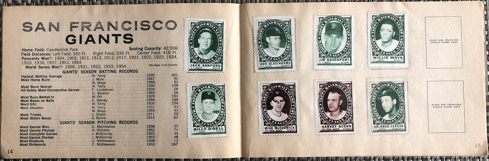
The stamps are fun but I prefer the 1961 version done in green and brown. To me not every 'advance' means progress!

I had this Gus Triandos Baseball Buck in my Orioles collection. Gus agreed to move to the '62 binder for the cause. Oh, one thing I just now noticed. The text over on the left side ends with "He's an ex-Yankee." So what?


I will add a wrapper at some point. I think it's more of a part of a 'complete' set than the inserts but it is also much more costly. I can wait until I find the right one.

A couple of weeks ago I saw someone mention a 1962 printing plate that they had in their collection. I had never considered that before and thought it might be a nice addition to the '62 build. But I wasn't going to go overboard. i found this example of a common card plate on eBay and picked it up. It has ink residue but I don't mind.

So there it is....the 'Commishbob' version of a complete 1962 Topps baseball set. It's not a 'master set' but it has everything my complete set definition calls for.

The '62 set doesn't get a lot of hobby love. There are too many capless player photos and the wood-grain border isn't to everyone's taste. I've even read comments criticizing the All Star subset which 'too closely' resembles the base cards. Oh, well. But I challenge anyone to come up with flagship set whose opening three binder pages match the 1962 Topps for star power. Check them out:


Good stuff, right? I thought so.

Wednesday, October 24, 2018

Two More Oldies

Here are a couple more of my recent 'grab-bag' vintage pick-ups. Neat cards in so-so condition. I have a few cards from the 1948 Bowman set but Bobby Thomson is the first 'name' player I own. This is his rookie card and this was Bowman's 'rookie' effort in the production of baseball cards.


Bobby Thomson is known to every baseball fan for his 'Shot Heard 'Round The World' off Ralph Branca which won the 1951 pennant in a playoff over the Dodgers.


1934 Tommy Bridges Batter-Up


EDIT: This was posted while I waited for the park-and-ride shuttle last night and was an early and incomplete version. I had a paragraph on Tigers' pitcher Tommy Bridges which didn't make it in. LOL I'll fix that now....

Tommy Bridges pitched 16 seasons in the majors, all for Detroit, The last two were abbreviated stints after he did his WWII military service. While he was a full time starter Bridges was a workhorse who led the league in wins, shutouts and strikeouts at various times. He fell just short of 200 wins and was a six-time All-Star.

He was a part of two Tigers Series titles and four AL championships. Here is something from Wikipedia related to the Tigers' championship 1935 season:


Bridges had another strong season in 1935, going 21–10 with 23 complete games. He also pitched a complete game victory in the last game of the 1935 World Series. With the score tied 3–3 in the top of the ninth, Bridges gave up a leadoff triple to Stan Hack, but retired the next three batters without the runner on third scoring. In the bottom of the ninth, Goose Goslin drove in the winning run with two outs, and the Tigers won their first championship. After the game, manager Mickey Cochrane said the following of Bridge's gutsy performance:

"A hundred and fifty pounds of courage. If there ever is a payoff on courage, this little 150 pound pitcher is the greatest World Series hero."

In a nationwide poll Bridges was named the No. 2 sports hero of 1935, behind Notre Dame football player Andy Pilney.
 This is the first Batter-Up card in my collection.

Sunday, October 21, 2018

New York Rangers Matchbook Covers


Well, if everything has gone according to plan and Blogger is cooperating (harrumph) this will post as I'm inside Madison Square Garden in beautiful New York City. I'll be watching just my second Rangers home game since 1970. The last time I was in the Garden for a Rangers game was 2005 against the Sabres and I'm not ashamed to say I was very misty-eyed walking in after 35 years.

I'll try to hold it together this time.

In honor of that I'm posting my oldest Rangers memorabilia pieces, three matchbook covers featuring players my father saw as a kid in the 30s. The Rangers were the only team he and I 'shared' and I will always remember his rule on weekends when the Rangers were playing....'No TV or radio allowed'. Together we would watch the same-day taped game broadcast, usually on the basement TV. He didn't want the result known beforehand. I had usually snuck a listen to my transistor radio or learned the score from my friends on the block. I never told him though!


Ott Heller, Murray Murdoch and Butch Keeling played together in the old MSG for most of the 30s. The Blueshirts were a fairly successful franchise in those days. Between their joining the modern NHL in 1926 and 1941 they won three Stanley Cups and made the playoffs in all but one season.

Ott Heller's actual first name was 'Ehrhardt' and was known as 'Ott', never Otto, at least in every Rangers reference that I own. The matchbook cover is in error.


Heller, Murdoch and Keeling played together on one Cup-winning club...the 1932/33 Rangers. And no, I am not old enough to have seem them in person. I only go back to about 1958 as a fan.


I love the reference to a team nickname I've never heard, the Garden Horsemen, on Murdoch's cover. I don't know and can't find any backstory on that. But I like it.


As I type this early in the week the Rangers are looking even worse than I expected them to look so far. But win or lose the game I'm watching on Sunday this is my team, always and forever. #LGR